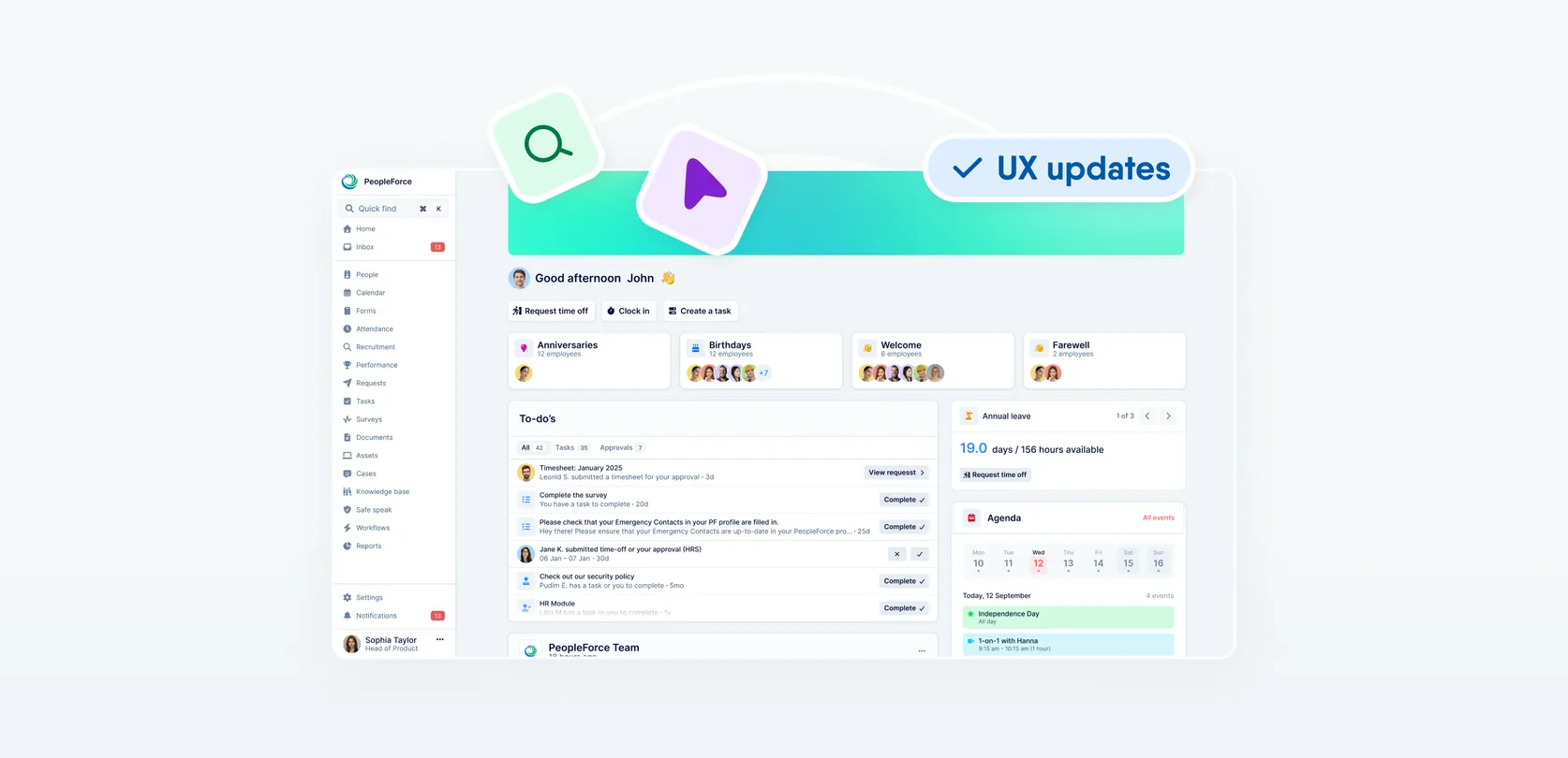
A fresh feel for PeopleForce: UX updates you’ll notice
We’re rolling out a set of UX improvements designed to make PeopleForce feel lighter, calmer, and easier to use every day — for you and your employees.
These updates follow one clear idea: give your work more space, reduce distractions, and keep everything exactly where you expect it to be.
Let’s walk through what’s changing, why we’re doing it, and how it improves your daily experience.
🧭 One navigation. More space for what matters.

As PeopleForce grows, more of your work happens inside tables, calendars, lists, and reports. That makes screen space more valuable than ever.
What’s changing?
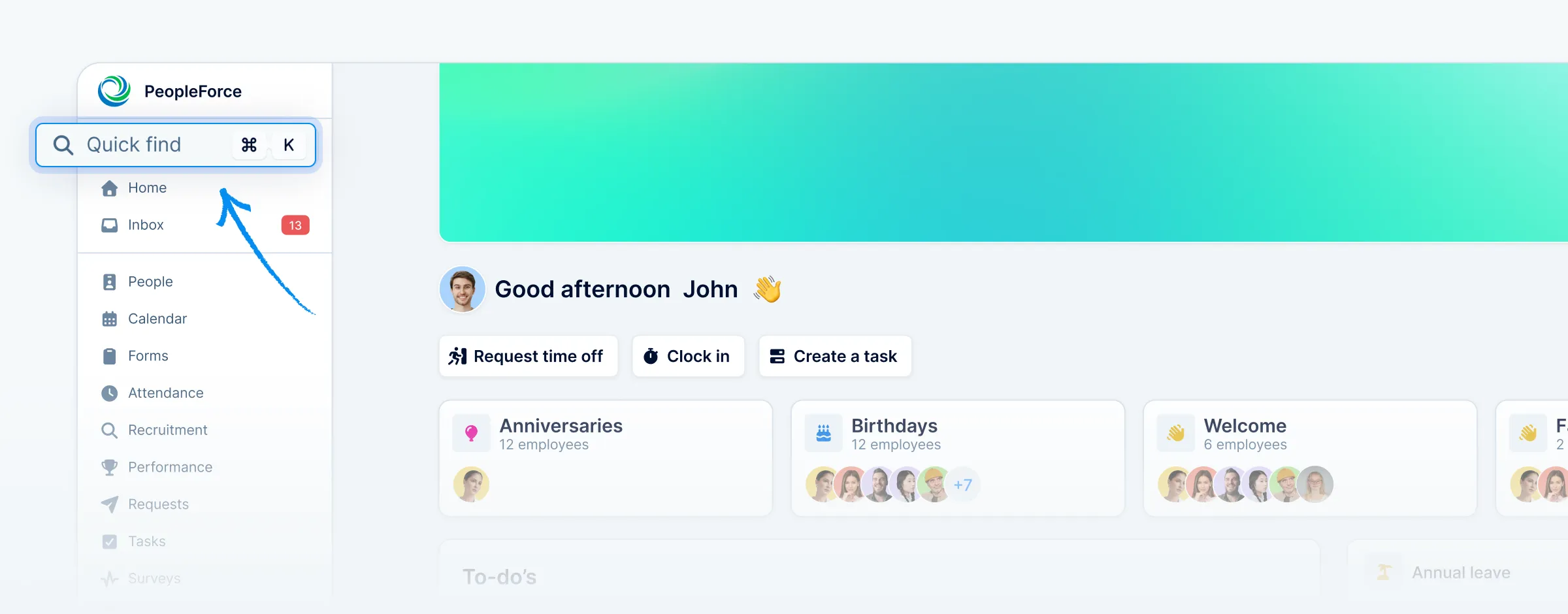
We’re removing the top navigation bar and unifying navigation into a single, predictable place — the sidebar.
Here’s what that means in practice:
- Top navigation is removed. All navigation now lives in the sidebar, so there’s only one place to look.
- The logo moves into the sidebar. This completes the visual and functional unification.
🔔 Heads up for admins: sidebar logo
The sidebar uses a compact logo format to support the new unified navigation.
- PeopleForce logo mark will be shown by default
- Optional: upload a short / icon version of your company logo
- Notifications move to a sticky bottom panel. Actions previously on the right side of the top bar are now always within reach, without taking up vertical space.
- Quick Add becomes part of Quick Find (Cmd + K). Create anything from anywhere, instantly.
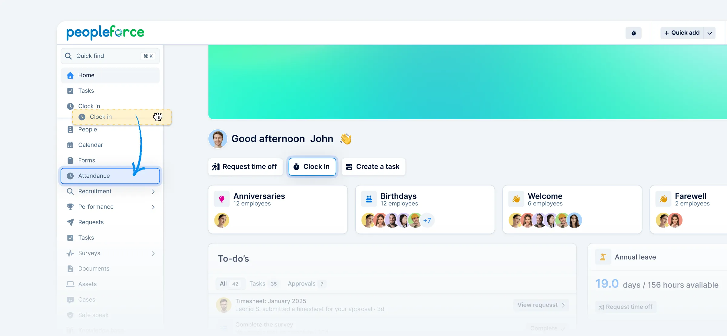
- Clock in stays fast and accessible. Start or stop time tracking via Cmd + K, alongside other global actions.
Why we’re doing this
Removing the top bar gives more room to the things you actually work with complex pages like People or Vacancy.
This means:
- more people visible in lists
- more data visible in reports without extra scrolling
- calendars and schedules that feel less cramped
Simply put: less UI, more work getting done.
🎯 Clearer controls. Less visual noise.
With navigation simplified, we can place filters and controls where they belong — closer to the content they affect.
What you’ll notice
- Filters are easier to understand
- Less clicks — you don’t need to open a separate drawer, and you can see the results instantly as you apply them
- It’s clearer what data you’re currently viewing
- Adjusting views takes fewer steps and less guesswork
By keeping navigation in one place and actions easy to reach, the interface feels calmer — and it’s easier to stay focused on the task at hand.
Where did things go?
To make the transition easier, here’s where to find key actions now:
- My profile→ in the sidebar profile section
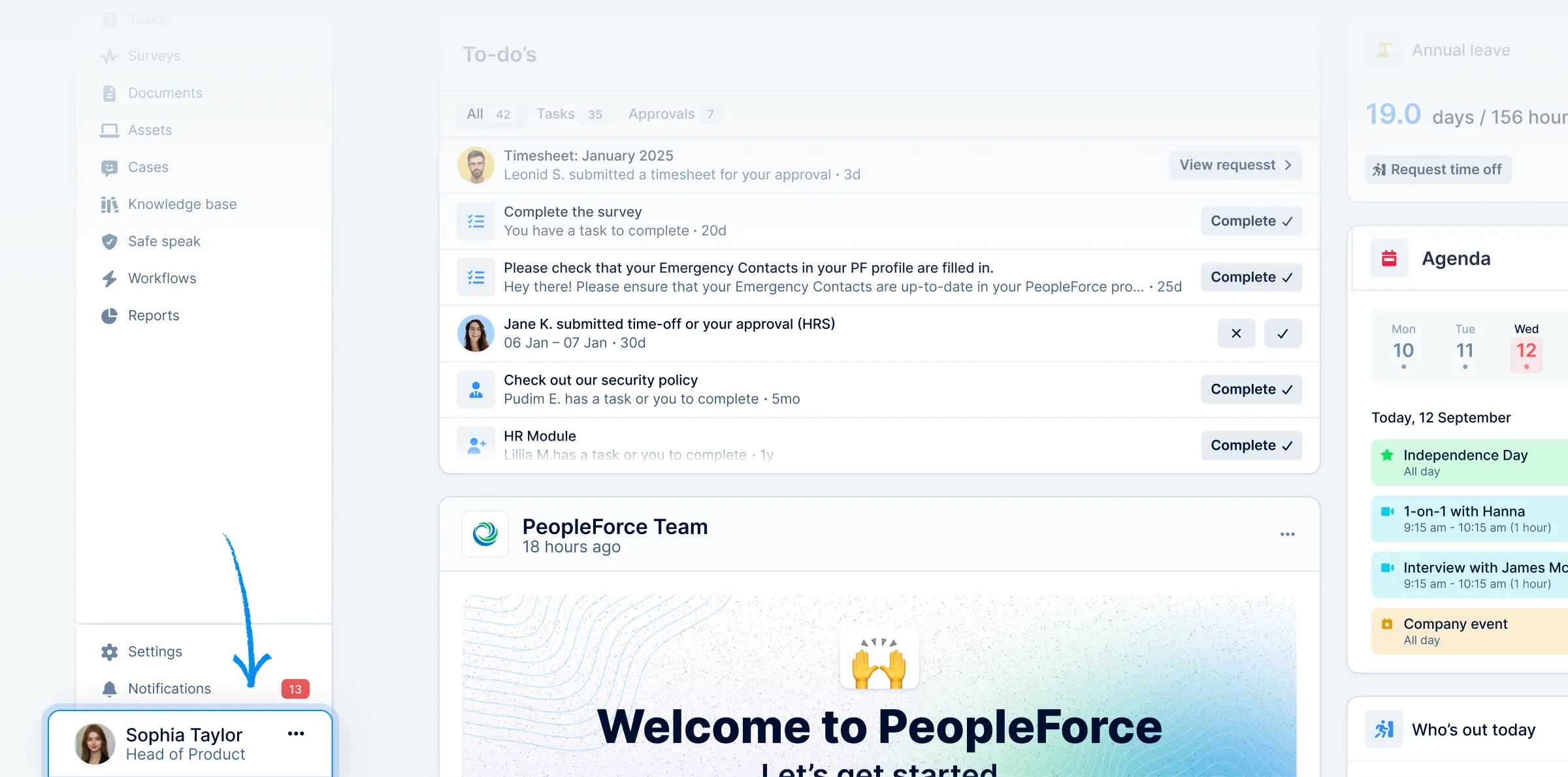
- Notifications→ in the sidebar below “Settings”
- Quick Add→ inside Quick Find (Cmd + K)
- Clock in→ will remain a quick action on the homepage, also in Quick Find (Cmd + K)
Everything is still there — just placed more intentionally.
🙌 Saying goodbye to the “Me” tab

You may notice that the "Me" tab is disappearing from the sidebar. Nothing is being removed — but a lot is becoming clearer.
What changed?
The "Me" section used to combine:
- 1:1s
- Objectives
- Reviews
- Feedback
- Interviews
Over time, it became a mixed space, pulling features from different product areas into one personal hub.
We’re now moving each feature into its natural, dedicated home, where it can exist more clearly.
Where things live now
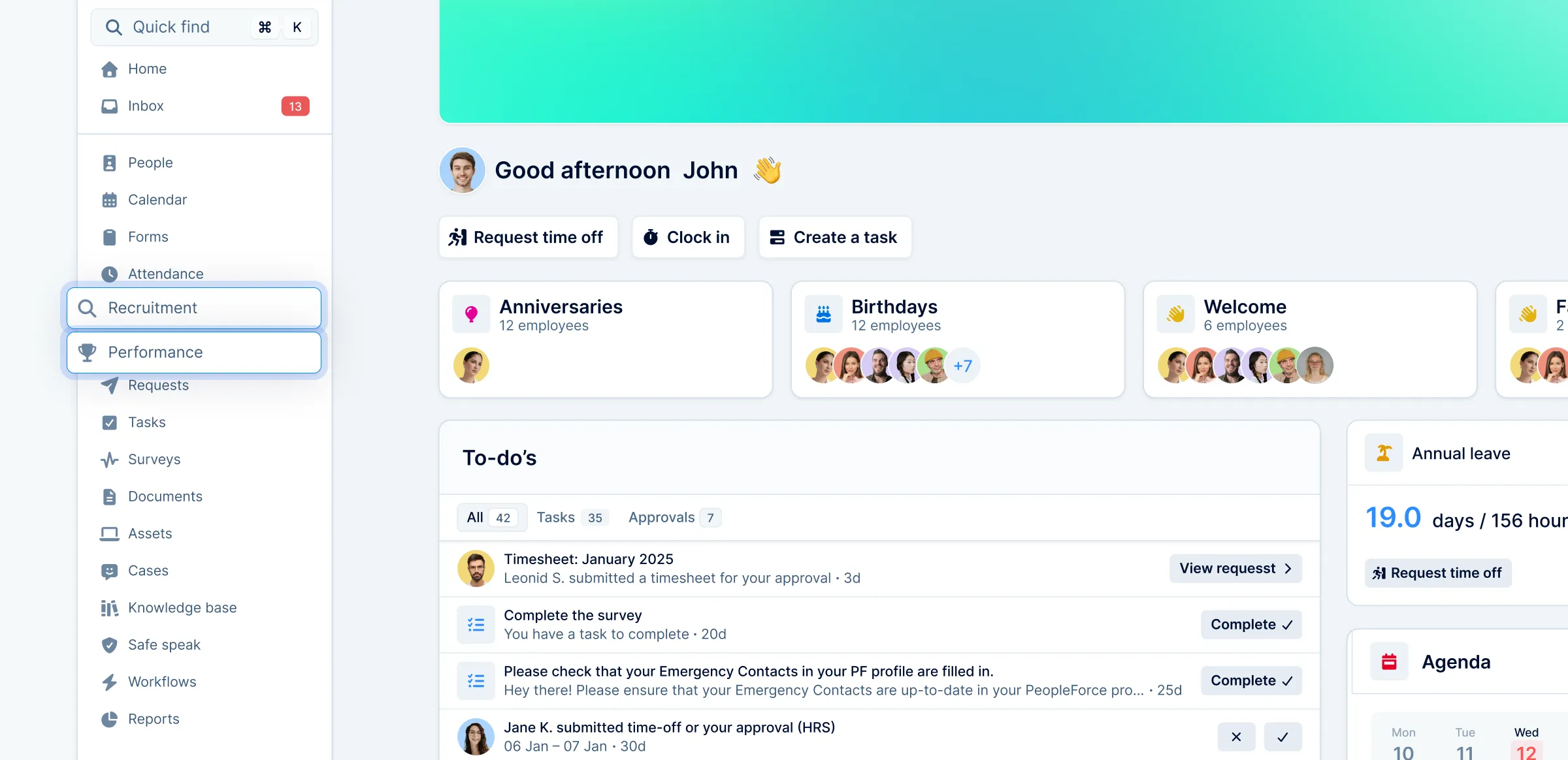
- 1:1s, KPIs, Objectives, Reviews, Feedback → Performance, with a clear switcher between Company / Team / My views (based on permissions)
- Interviews → Recruitment, under Candidates, where hiring already lives
Why this is better
- Clear ownership of features. Each area lives in one logical place.
- Consistent experience. Company, Team, and My views use the same familiar switcher everywhere.
- Less duplication, less confusion. No overlap between personal hubs and product sections.
The result: a calmer sidebar, more predictable navigation, and a smoother experience — especially for new users.
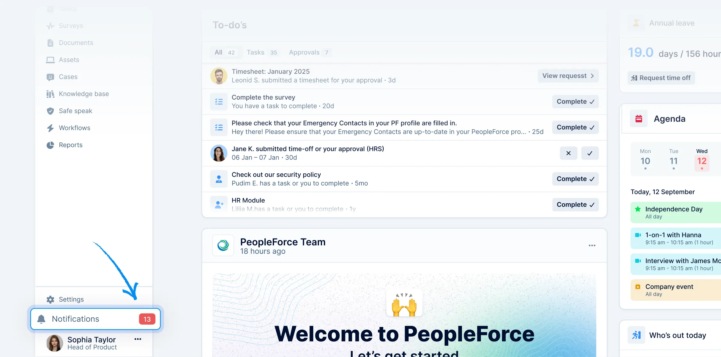
📥 Spotted new inbox? Now it’s more than just tasks
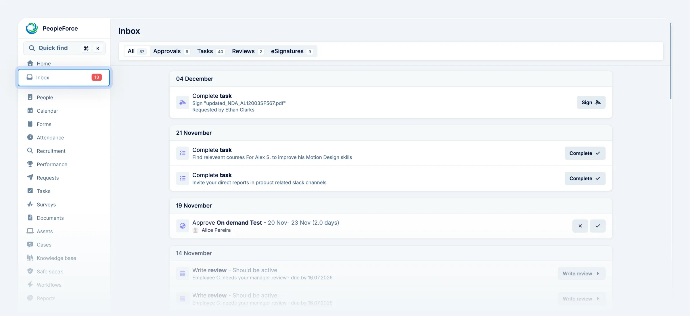
You might have noticed a new Inbox tab in the sidebar. That’s intentional — and important.
Previously, this section highlighted only tasks. But tasks are just one part of your workday. Approvals, reviews, feedback, surveys, and e-signatures also need timely attention.
What’s new?
Inbox brings all actionable items into one place.
- One badge for all your work. The sidebar badge now counts tasks, approvals, reviews, and signatures.
- From tasks to actions. Tasks haven’t disappeared — they’re simply part of a bigger picture.
- One page, full control. Every item comes with context and a clear action button, so you can complete work without jumping between sections.
Inbox helps you manage your day more evenly — and miss less along the way.
This is just the beginning
All of these updates follow the same direction:
- fewer places to look
- fewer decisions to make
- more focus on what actually matters
💬 Help us shape what’s next
These UX updates are built with your feedback in mind — and we’re listening closely as they roll out.
If something feels unclear, unexpected, or could work better, tell us about it. Your feedback directly influences how PeopleForce evolves.
👉 Share your feedback — contact us at support@peopleforce.io.
Recent updates
New job multiposting solution to maximize your hiring efficiency
With PeopleForce’s job multiposting, you can automatically post your job vacancies across 3000+ sites and receive applications from top talent directly into your system.
Sign documents with QES in PeopleForce using the Autenti integration — and here’s how
For all customers using electronic signatures who want to speed up and simplify document management with a seamless Autenti integration – check out our guide.
Automate monthly bonus entry with Request Forms
Discover how to automate periodic form requests with PeopleForce's workflows. Embrace improved communication and transparent processes!